May 4, 2026

Est 6 min
In some circles, digital accessibility has a bad reputation, but it is an undeserved one.
It is still viewed as complicated, expensive, time-consuming or something only the specialists can handle.
Yet, in practice, digital accessibility is much more achievable than you’d believe.
Don’t take our word for it.
Here are ten accessibility quick wins you can begin implementing today.

Clear, intuitive structure
Without a clear structure, even the most engaging content is difficult to navigate or understand.
For many users, including those with cognitive or visual impairments, headings and other page markers act as signposts.
They ensure users are always confident of their location on a page and know which steps to take next.
Make your own structure more intuitive by:
- Ensuring all page sequences, headings, links and buttons appear in a logical order so that they flow intuitively.
- Sharing the most important information first so readers can find what they need quickly.
- Ensuring users can interact with your features using alternative methods, i.e. keyboard input.
- Giving all menus, links, page markers and buttons meaningful, descriptive titles so that they behave as people expect them to.
- Following these best practices in documents like downloadable PDFs, too.
Plain and accessible language
If your content is hard to understand, users will soon lose patience, and the likelihood is that one of your competitors will gain a new follower.
Clear writing helps everyone follow your content with ease and ensures none of your important messages are lost:
- Avoid jargon, acronyms, or technical terms unless you explain them.
- Keep sentences short and direct-25 words maximum.
- Try not to introduce more than one clear idea per sentence, as it can be overwhelming for some readers.
Making content more readable
Large, complicated blocks of text can be overwhelming for readers with Dyslexia, visual impairments and other cognitive disabilities.
Improving the readability of your texts won’t take much effort, and it costs nothing:
- Make all paragraphs short and easy to scan, 4 to 6 sentences.
- Employ spacing to reduce cognitive load.
- Stick to one idea per paragraph whenever possible.
- Add bullet points or numbered lists to explain concepts or simplify large volumes of information.
Using inclusive language
Words are important because they tell someone: this site, or product, is for you.
They say:
We value your opinions and your needs.
Here are some tips to ensure you don’t alienate anyone:
- Avoid using terms that focus on limitations, such as “handicapped”, “confined to a wheelchair”, and “special needs”.
- Avoid gendered language, and stick to neutral pronouns
- Steer clear of terms like “normal,” which can unintentionally make people feel less valued.
Passion4Social’s Anti-ableism Dictionary is a free resource that contains definitions of disability-related words and terms, promoting inclusive alternatives to discriminatory language.
Nail your colour contrasts
Not everyone experiences or understands colour the same way.
Someone with sight loss, for example, may struggle to read text if the background it is overlaid on is a certain colour.
Include everyone by:
- Ensuring text stands out clearly from the background. A contrast ratio of at least 4.5:1 is recommended in the WCAG 2.1 (Web Content Accessibility Guidelines).
- Avoiding tricky combinations like red and green, or blue and yellow, which are hard for colour blind users to distinguish.
- Never use colour alone to convey messages as it won’t be recognised by some assistive technologies.
Keeping fonts simple
Decorative fonts might look appealing, but they can be difficult to read for some users, especially users with dyslexia or visual impairments:
- Stick with simple, clear options like Arial or Calibri.
- Keep texts at 12 point, or larger where possible, as recommended in WCAG 2.1.
- If you are including text in your images, ensure it is easy to read and well contrasted.
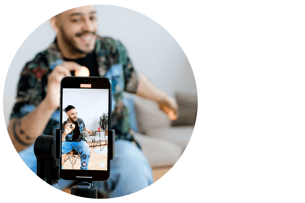
Creating accessible videos
It is patronising to assume that some users simply won’t want to access your videos, because they cannot view or hear the content without assistance.
Taking just a bit of extra care ensures every user can enjoy the full experience:
- Include closed captions to ensure Deaf users and those with cognitive disabilities can follow conversations and important sound cues.
- Place text considerately to ensure it doesn’t cover faces or other important visuals.
- Check subtitles for accuracy: auto-generated ones often need editing.
- Create your own subtitles and transcripts if possible.
- Include audio descriptions that tell users what is happening on screen.
- Choose a video player that allows keyboard navigation and lets users turn captions on or off easily.
Using descriptive links
For people using assistive technologies, constantly reading a stream of links that say “Click here” is frustrating.
It often leaves them unable to complete tasks because they know nothing about the destination of the link.
Instead:
- Clearly describe where the link goes. For example: “Read our accessibility guide” or “Explore our services”.
- Never leave links in their original format. Listening to a stream of letters and numbers interrupts a page’s flow and breaks users’ concentration.
- Use a link shortener.

Adding effective alt text to images
Images without alt text mean users miss out on important information and feel out of the loop.
Alt text describes images for people who can’t see them, or who prefer to process messages in a text format.
Write effective alt text by:
- Keeping descriptions short but informative. Ask yourself what adds meaning or value to the alt text.
- Describe what is in the image, including any important text.
- Mention context: especially important in the case of jokes.
- If the description becomes too long, consider putting that information in the main content instead.
- Avoid using auto-generated alt text, which can be inaccurate.
Give your users control
Accessibility is also about choice, and that means wherever possible, you enable people to personalise the content to their needs.
It signals your commitment to accessibility and shows how much you value them.
Here are some examples of things you can do:
- Provide clearly sign-posted options for adjusting text size or settings.
- Enable users to stop animations and videos that may be distracting or even cause seizures.
- Avoid autoplay content that causes confusion for some users.

Bonus tip: Keep improving
Standards are changing all the time, and so should your approach.
In this last year alone, we have seen the introduction of the European Accessibility Act (EAA), which is legally binding for UK businesses trading with EU customers, and WCAG 3.0 is in the pipeline.
Our advice to you would be:
- Revisit your content and digital accessibility strategy regularly.
- Stay informed about guidelines like WCAG.
- Talk openly about accessibility across your organisation, because it is everyone’s responsibility.
Digital accessibility need never be overwhelming.
It begins with awareness, then small, consistent actions.
The organisations that are leading the way are not doing anything extraordinary; they are simply designing with people in mind from day one.
If you do that too, you will create better, more intuitive experiences for everyone.
Share via social media:


You may also like...
10 simple steps to writing accessible content
Learn how to make your content easier to find, understand,...

Teaching digital accessibility early: The future of inclusive education
In this article: Why accessibility should be integrated in education...
Accessibility beyond websites: The rise of accessible everything
In today’s blog, you will read about: How digital accessibility...

Accessible Content Does Not Need to Be Dull
Who says accessible content has to be boring? Some people...

Digital Accessibility in Action: The Platforms, Creators and Advocates Amplifying Disabled Voices
As we tell anyone who will listen, creating accessible digital...

What you need to know about WCAG 3.0
October 28, 2026 , 12 pm - 1 pm GMT

Accessible images: The art of alt text
November 25, 2026 , 12 pm - 1 pm GMT

Overlays vs lived experience users: Shortcut or setback?
Explore the arguments for two powerful approaches to digital accessibility: the convenience of automated overlays...

When “Save as PDF” isn’t enough: Why accessible PDFs require knowledge, planning, testing and time
In this article, you will discover: Polished-looking PDFs are not...

The EAA one year on: What has really changed?
In this blog, you will read about: What has really...

The sales you never got to see and why digital accessibility could be the reason
How sales can be lost without ever appearing in your...

When accessibility is an afterthought: Voting remains a postcode lottery for disabled voters
In this blog, you will discover: How accessible voting exists...

The European Accessibility Act
A practical guide to the European Accessibility Act, explaining what...

Exploring assistive tech in cyber security tools
With CYBERUK 2026 on the horizon, Net-Defence and Passion4Social CIC...

Who is being left behind? The entry point is digital
Digital inaccessibility is a significant structural barrier that widens the...

When accessibility is an afterthought: Patients pay the price
Government organisations and institutions spend millions on cybersecurity, protecting their...

Accessibility Quiz
Our quiz assesses accessibility maturity across strategy, testing, culture, and...

The Accessibility for All project: Creating paid digital careers for people facing exclusion
Just 5.5 million disabled people are in employment, yet more...

Digital Accessibility and the Law
Join Passion4Social for a practical 60-minute webinar exploring the intersection of digital accessibility and the...

Create, Test, Include – Accessible Documents
This webinar, which coincided with Global Accessibility Awareness Day (GAAD), will dive into how we...